2022년 2월 19일 토요일

데이터 표현에 따라 의미도 달리 전달된다.

이 포스트는 본인 Tistory, Blogger 및 Naver에 중복 포스팅 한 것임.


데이터 과학자로 여러가지 업무를 수행하지만 결국 마지막은 데이터 표현과 이에 대한 설명과 해석을 글로 쓰는 것으로 끝난다.

근래 어느 특정 암종의 치료제 후보 물질 관련 출판을 하며 기전 설명과 관련한 추가적인 증거를 제시해야 했다.

 샘플 수가 적었기 때문에 점도표 (dot plot)으로 표현하는 것을 고려했다. 

이 포스트에서 원본 데이터를 사용할 수는 없어, 유사한 예를 위해 아래와 같이 toy dataset을 우선 만들었다.

1
2
3
4
5
6
7
8
9
10
11
12
13
14
15
16
17
18
19
20
21
22
23
#Check necessary packages
packages <- c('ggplot2''plyr''ggpubr')
install.packages(setdiff(packages, rownames(installed.packages())))  
 
#Load packages
library(ggplot2)
library(plyr)
library(ggpubr)
 
#Set working directory
setwd('~/Tmp')
 
#Create a toy dataset as a matrix
matrix_data=matrix(c(92,129,64,'DMSO','Cell.line1'
                     134,126,77,'DMSO','Cell.line2'
                     135,143,64,'DMSO','Cell.line3'
                     85,128,52,'Treat1','Cell.line1'
                     146,118,60,'Treat1','Cell.line2'
                     123,122,76,'Treat1','Cell.line3'
                     103,111,55,'Treat2','Cell.line1'
                     150,121,64,'Treat2','Cell.line2'
                     122,116,78,'Treat2','Cell.line3'), byrow=T, ncol=5)
print(matrix_data)
cs


그림 1. The output of matrix of toy dataset

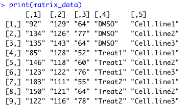
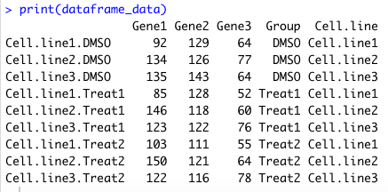
ggplot2 패키지는 dataframe 객체를 입력 받으므로, 해당 matrix에서 dataframe을 생성 해야 한다. 또한 R에서 matrix를 만들 때, 숫자와 글자 데이터를 혼용하면 모든 값이 글자 데이터형으로 설정되기 때문에 이를 숫자형으로 casting 해줘야 한다.

1
2
3
4
5
6
7
8
9
10
11
12
13
14
15
16
17
18
19
#Create a dataframe from a matrix
dataframe_data=as.data.frame(matrix_data)
print(dataframe_data)
 
#Set columns and rows names
colnames(dataframe_data) = c('Gene1''Gene2''Gene3''Group''Cell.line')
rownames(dataframe_data) = c('Cell.line1.DMSO''Cell.line2.DMSO''Cell.line3.DMSO'
                             'Cell.line1.Treat1''Cell.line2.Treat1''Cell.line3.Treat1'
                             'Cell.line1.Treat2''Cell.line2.Treat2''Cell.line3.Treat2')
 
#Convert data types of numeric columns
#In the case of the dataframe creation from the matrix with mixed data
#All column is set as character by default
dataframe_data <- transform(dataframe_data, Gene1 = as.numeric(Gene1), 
                            Gene2 = as.numeric(Gene2),
                            Gene3 = as.numeric(Gene3))
 
print(dataframe_data)
 
cs


그림 2. The output of dataframe of toy dataset

이제 ggplot2로 점도표를 그려보자. 점도표와 함께 평균 값을 함께 그리기 위하여 stat_summary를 추가하였다. 테마는 grid line을 싫어하기 때문에 theme_classic()으로 잡아 준 후, 그 외 theme으로 legend는 없애고 x와 y tick labels는 출판 시 보통 지정된 최저 폰트 사이즈는 8이므로 그렇게 지정하였다. 각각의 plot 개체는 ggarrange()로 하나의 panel로 묶어 주었다.

1
2
3
4
5
6
7
8
9
10
11
12
13
14
15
16
17
18
19
20
21
22
23
24
25
26
27
28
29
30
31
32
33
34
35
36
#Variable for default font size in a plot
fontsize <- 8
 
#Create a dot plot
#each size of elements in the plot is adjusted for image file
p1 <- ggplot(dataframe_data, aes(x=Group, y=Gene1, fill=Group)) + 
  geom_dotplot(binaxis='y', stackdir='center', dotsize=2+ 
  stat_summary(fun=mean, color='black', size=0.1+  
  theme_classic() + 
  theme(legend.position='none'
        text = element_text(size = fontsize), 
        axis.text.x = element_text(angle = -315, hjust = 1), 
        axis.title.x=element_blank())
p2 <- ggplot(dataframe_data, aes(x=Group, y=Gene2, fill=Group)) +
  geom_dotplot(binaxis='y', stackdir='center', dotsize=2+ 
  stat_summary(fun=mean, color='black', size=0.1+ 
  theme_classic() + 
  theme(legend.position='none'
        text = element_text(size = fontsize), 
        axis.text.x = element_text(angle = -315, hjust = 1), 
        axis.title.x=element_blank())
p3 <- ggplot(dataframe_data, aes(x=Group, y=Gene3, fill=Group)) +
  geom_dotplot(binaxis='y', stackdir='center', dotsize=2+ 
  stat_summary(fun=mean, color='black', size=0.1+ 
  theme_classic() + 
  theme(legend.position='none'
        text = element_text(size = fontsize), 
        axis.text.x = element_text(angle = -315, hjust = 1), 
        axis.title.x=element_blank())
 
#combine all plots in one panel 3 x 1
pan1 <- ggarrange(p1, p2, p3, ncol = 3, nrow = 1)
#save as a png format file
ggsave('image1.png', plot = pan1, width = 9,  height = 4,  units = 'cm')
#display plot
pan1
cs

그림 3. Dot plots of toy dataset. Red, green, and blue dots represent expression levels of genes by groups, respectively. The black dot represents the mean value of gene expression of each group.


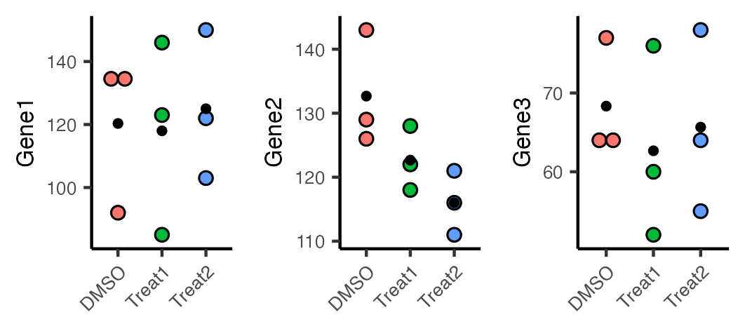
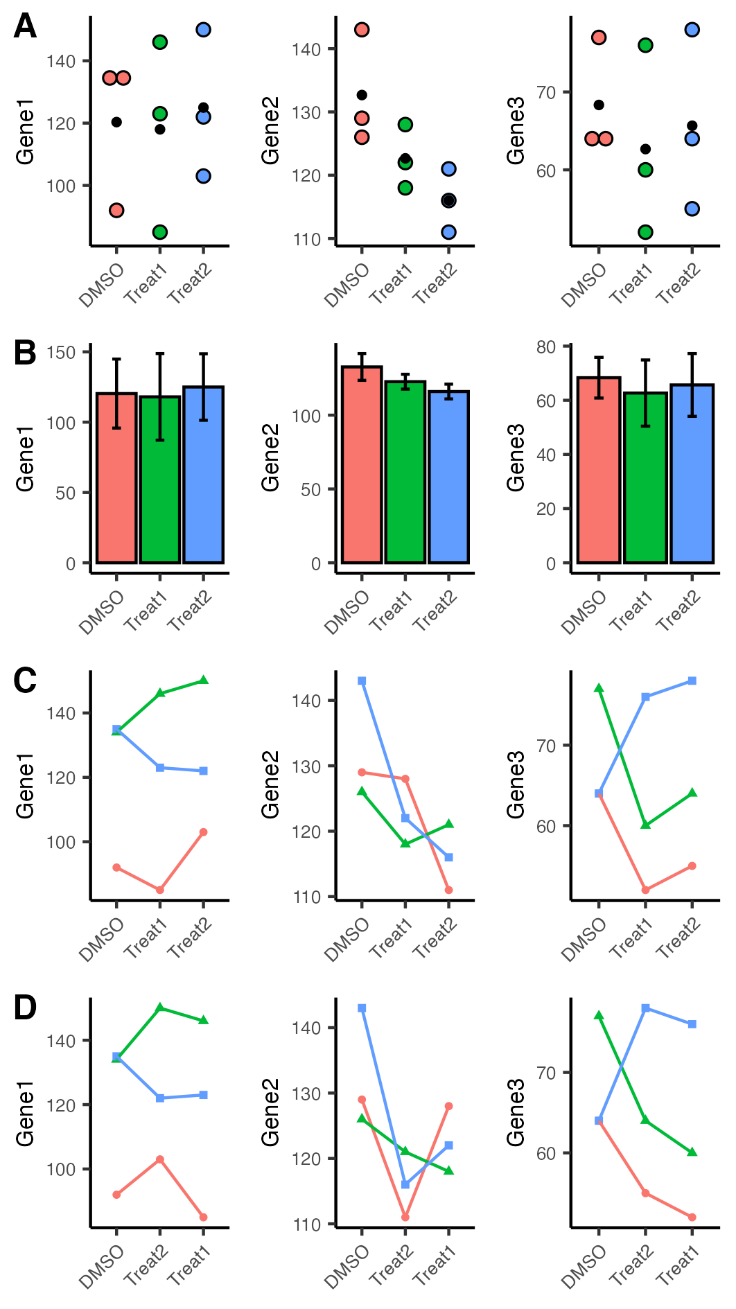
위 그림에서 보면 Gene2와 Gene3는 대조군 (control group)인 DMSO를 처리한 것에 비해 독립된 두 실험군 (case groups; Treat1 and Treat2)에서 평균 값 (black dots)이 내려간 것이 보이고, Gene1은 약간 내리거나 오르는 양상을 보였다. 전달하는 메시지가 약하다는 평가가 있었다. 그래서 다시 이 것을 전통적으로 생물학 실험에서 많이 제시하는 (가능하면 사용하지 말 것을 권고하는) 막대도표 + 에러바 (속칭 dynamite plot)로 다시 표현해보았다.

에러바를 그리기 위해서는 평균 값과 표준편차 (standard deviation) 값을 구해야 하므로, 데이터 프레임에 그룹별로 평균과 표준편차 값을 계산하여 대체하는 함수를 만들었다. 이 함수는 아래와 같이 데이터프레임을 넘겨받는다.

그림 4. A subset of toy dataset.

그리고 아래와 같이 이를 집계하여 리턴해주는 함수이다.

그림 5. The output of description of a subset of toy dataset

함수명은 data_summary()로 하였다.

1
2
3
4
5
6
7
8
9
10
11
12
13
14
15
16
17
18
19
20
21
22
23
24
25
26
27
28
29
30
31
32
33
34
35
36
37
38
39
40
41
42
43
44
45
46
47
48
49
50
51
52
53
54
55
56
57
58
59
60
61
62
63
64
65
66
67
68
69
70
71
72
73
74
75
76
77
78
79
80
81
82
#Data summary function to get mean and standard deviation (sd) of values by group
data_summary <- function(data, varname, groupnames){
  summary_func <- function(x, col){
    
    c(mean = mean(x[[col]], na.rm=TRUE),
      sd = sd(x[[col]], na.rm=TRUE))
  }
  data_sum<-ddply(data, groupnames, .fun=summary_func,
                  varname)
  data_sum <- rename(data_sum, c('mean' = varname))
  return(data_sum)
}
 
 
#Get mean and sd of Gene1 by Group
df2 <- data_summary(dataframe_data, varname='Gene1', groupnames=c('Group'))
#plot barplot
p4 <- ggplot(df2, aes(x=Group, y=Gene1,  fill=Group)) + 
  geom_bar(stat='identity', color='black', position=position_dodge()) +
  geom_errorbar(aes(ymin=Gene1-sd, ymax=Gene1+sd), width=.2,
                position=position_dodge(.9)) + 
  theme_classic() + 
  theme(legend.position='none'
        text = element_text(size = fontsize), 
        axis.text.x = element_text(angle = -315, hjust = 1), 
        axis.title.x=element_blank())
 
#Get mean and sd of Gene2 by Group
df2 <- data_summary(dataframe_data, varname='Gene2', groupnames=c('Group'))
#plot barplot
p5 <- ggplot(df2, aes(x=Group, y=Gene2,  fill=Group)) + 
  geom_bar(stat='identity', color='black', position=position_dodge()) +
  geom_errorbar(aes(ymin=Gene2-sd, ymax=Gene2+sd), width=.2,
                position=position_dodge(.9)) + 
  theme_classic() + 
  theme(legend.position='none'
        text = element_text(size = fontsize), 
        axis.text.x = element_text(angle = -315, hjust = 1), 
        axis.title.x=element_blank())
 
#Get mean and sd of Gene3 by Group
df2 <- data_summary(dataframe_data, varname='Gene3', groupnames=c('Group'))
p6 <- ggplot(df2, aes(x=Group, y=Gene3,  fill=Group)) + 
  geom_bar(stat='identity', color='black', position=position_dodge()) +
  geom_errorbar(aes(ymin=Gene3-sd, ymax=Gene3+sd), width=.2,
                position=position_dodge(.9)) + 
  theme_classic() + 
  theme(legend.position='none'
        text = element_text(size = fontsize), 
        axis.text.x = element_text(angle = -315, hjust = 1), 
        axis.title.x=element_blank())
 
pan2 <- ggarrange(p4, p5, p6, ncol = 3, nrow = 1)
ggsave('image2.png', plot = pan2, width = 9,  height = 4,  units = 'cm')
pan2
 
#Draw line plot with dot by cell lines
p7 <- ggplot(dataframe_data, 
             aes(x=Group, y=Gene1, group=Cell.line, 
                 color=Cell.line, shape = Cell.line)) + 
  geom_point(size=1)+geom_line()+theme_classic()+
  theme(legend.position='none', text = element_text(size = fontsize), 
        axis.text.x = element_text(angle = -315, hjust = 1), 
        axis.title.x=element_blank())
p8 <- ggplot(dataframe_data, 
             aes(x=Group, y=Gene2, group=Cell.line, 
                 color=Cell.line, shape = Cell.line)) + 
  geom_point(size=1)+geom_line()+theme_classic()+
  theme(legend.position='none', text = element_text(size = fontsize), 
        axis.text.x = element_text(angle = -315, hjust = 1), 
        axis.title.x=element_blank())
p9 <- ggplot(dataframe_data, 
             aes(x=Group, y=Gene3, group=Cell.line, 
                 color=Cell.line, shape = Cell.line)) + 
  geom_point(size=1)+geom_line()+theme_classic()+
  theme(legend.position='none', text = element_text(size = fontsize), 
        axis.text.x = element_text(angle = -315, hjust = 1), 
        axis.title.x=element_blank())
 
pan3 <- ggarrange(p7, p8, p9, ncol = 3, nrow = 1)
ggsave('image3.png', plot = pan3, width = 9,  height = 4,  units = 'cm')
pan3
cs


그림 6. Bar plots with standard deviation (SD) error bars of toy dataset. 

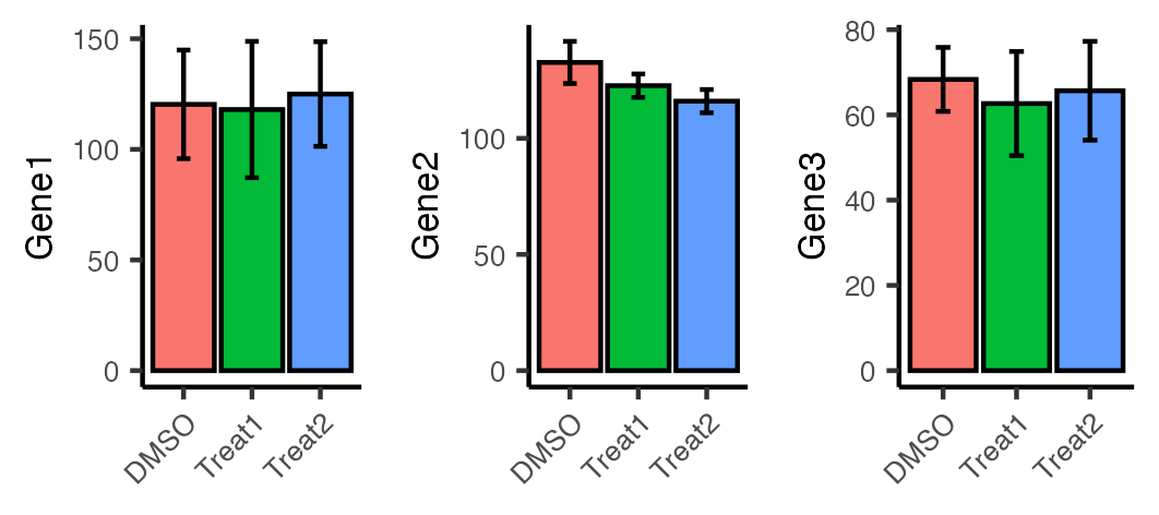
위 그림 3과 같이 Gene2와 Gene3에서는 독립된 약물 투입 그룹 (Treat1 and Treat2 groups)에서 감소되는 경향을 확인 할 수 있었으나 전달되는 시각 효과가 적다고 판단했다.

그래서 이번에는 선도표 (line plot)으로 데이터를 표현 해보기로 하였다. 그리고 각각의 세포주 (cell line) 별로 다르게 그려보기로 하였다.

1
2
3
4
5
6
7
8
9
10
11
12
13
14
15
16
17
18
19
20
21
22
23
24
25
26
#Draw line plot with dot by cell lines
p7 <- ggplot(dataframe_data, 
             aes(x=Group, y=Gene1, group=Cell.line, 
                 color=Cell.line, shape = Cell.line)) + 
  geom_point(size=1)+geom_line()+theme_classic()+
  theme(legend.position='none', text = element_text(size = fontsize), 
        axis.text.x = element_text(angle = -315, hjust = 1), 
        axis.title.x=element_blank())
p8 <- ggplot(dataframe_data, 
             aes(x=Group, y=Gene2, group=Cell.line, 
                 color=Cell.line, shape = Cell.line)) + 
  geom_point(size=1)+geom_line()+theme_classic()+
  theme(legend.position='none', text = element_text(size = fontsize), 
        axis.text.x = element_text(angle = -315, hjust = 1), 
        axis.title.x=element_blank())
p9 <- ggplot(dataframe_data, 
             aes(x=Group, y=Gene3, group=Cell.line, 
                 color=Cell.line, shape = Cell.line)) + 
  geom_point(size=1)+geom_line()+theme_classic()+
  theme(legend.position='none', text = element_text(size = fontsize), 
        axis.text.x = element_text(angle = -315, hjust = 1), 
        axis.title.x=element_blank())
 
pan3 <- ggarrange(p7, p8, p9, ncol = 3, nrow = 1)
ggsave('image3.png', plot = pan3, width = 9,  height = 4,  units = 'cm')
pan3
cs

그림 7. Line plots of toy dataset. Red circle, green triangle, and blue square represent cell line1, cell line2, and cell line3, respectively.

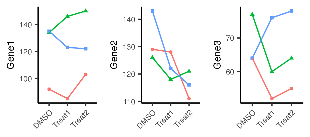
앞선 점도표 및 막대도표 대비하여 Gene2의 경우 훨씬 드라마틱하게 떨어지는 느낌을 준다. 하지만 Gene1의 경우나 Gene3의 경우 Treat2 그룹에서 올라가서 마치 증가된 것과 같은 느낌을 주는 것도 마찬가지다. 실험군인 Treat1과 Treat2는 독립적인 실험 결과이므로 나열 순서는 의미가 없다. 그래서 x축의 나열 순서를 DMSO, Treat2, Treat1 순으로 수정을 해보기로 했다.

1
2
3
4
5
6
7
8
9
10
11
12
13
14
15
16
17
18
19
20
21
22
23
24
25
26
27
28
#Set order of Group
level_order <- c('DMSO''Treat2''Treat1')
 
p10 <- ggplot(dataframe_data, 
              aes(x=factor(Group, level = level_order), y=Gene1, 
                  group=Cell.line, color=Cell.line, shape = Cell.line)) + 
  geom_point(size=1)+geom_line()+theme_classic()+
  theme(legend.position='none', text = element_text(size = fontsize), 
        axis.text.x = element_text(angle = -315, hjust = 1), 
        axis.title.x=element_blank())
p11 <- ggplot(dataframe_data, 
              aes(x=factor(Group, level = level_order), y=Gene2, 
                  group=Cell.line, color=Cell.line, shape = Cell.line)) + 
  geom_point(size=1)+geom_line()+theme_classic()+
  theme(legend.position='none', text = element_text(size = fontsize), 
        axis.text.x = element_text(angle = -315, hjust = 1), 
        axis.title.x=element_blank())
p12 <- ggplot(dataframe_data, 
              aes(x=factor(Group, level = level_order), y=Gene3, 
                  group=Cell.line, color=Cell.line, shape = Cell.line)) + 
  geom_point(size=1)+geom_line()+theme_classic()+
  theme(legend.position='none', text = element_text(size = fontsize), 
        axis.text.x = element_text(angle = -315, hjust = 1), 
        axis.title.x=element_blank())
 
pan4 <- ggarrange(p10, p11, p12, ncol = 3, nrow = 1)
ggsave('image4.png', plot = pan4, width = 9,  height = 4,  units = 'cm')
pan4
cs


그림 8. Line plots of toy dataset in the order of DMSO, Treat2, and Treat1. Red circle, green triangle, and blue square represent cell line1, cell line2, and cell line3, respectively.

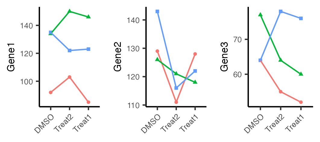
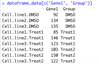
Gene2는 앞서 그림 7에 비해 떨어지는 것이 드라마틱하지 않지만, Gene 3의 경우 대조군인 DMSO에 비해 떨어지는 Treat2, Treat1에서 더 떨어지는 느낌을 주었으며, Gene1의 경우도 빨간색 원의 Cellline 1과 파란색의 Celline 3에서 DMSO에 비해 떨어지는 것이 보이므로, DMSO에 비해 Treat1과 Treat2에서 Gene1, Gene2, 및 Gene3에서 떨어지는 경향성이 보인다라는 메시지를 가장 잘 전달한다고 판단하였다.

위 그림 3, 그림 6, 그림 7과 그림 8을 하나로 묶었다.

1
2
3
4
5
6
#Wrap up all pannels into one image with labels
pan5 <- ggarrange(pan1, pan2, pan3, pan4, ncol = 1, nrow = 4
                  labels = c('A''B''C''D'), font.label = list(size = 12))
ggsave('image5.png', plot = pan5, width = 9,  height = 16,  units = 'cm')
pan5
 
cs

그림 9. Plots of toy dataset.

댓글 없음:

댓글 쓰기